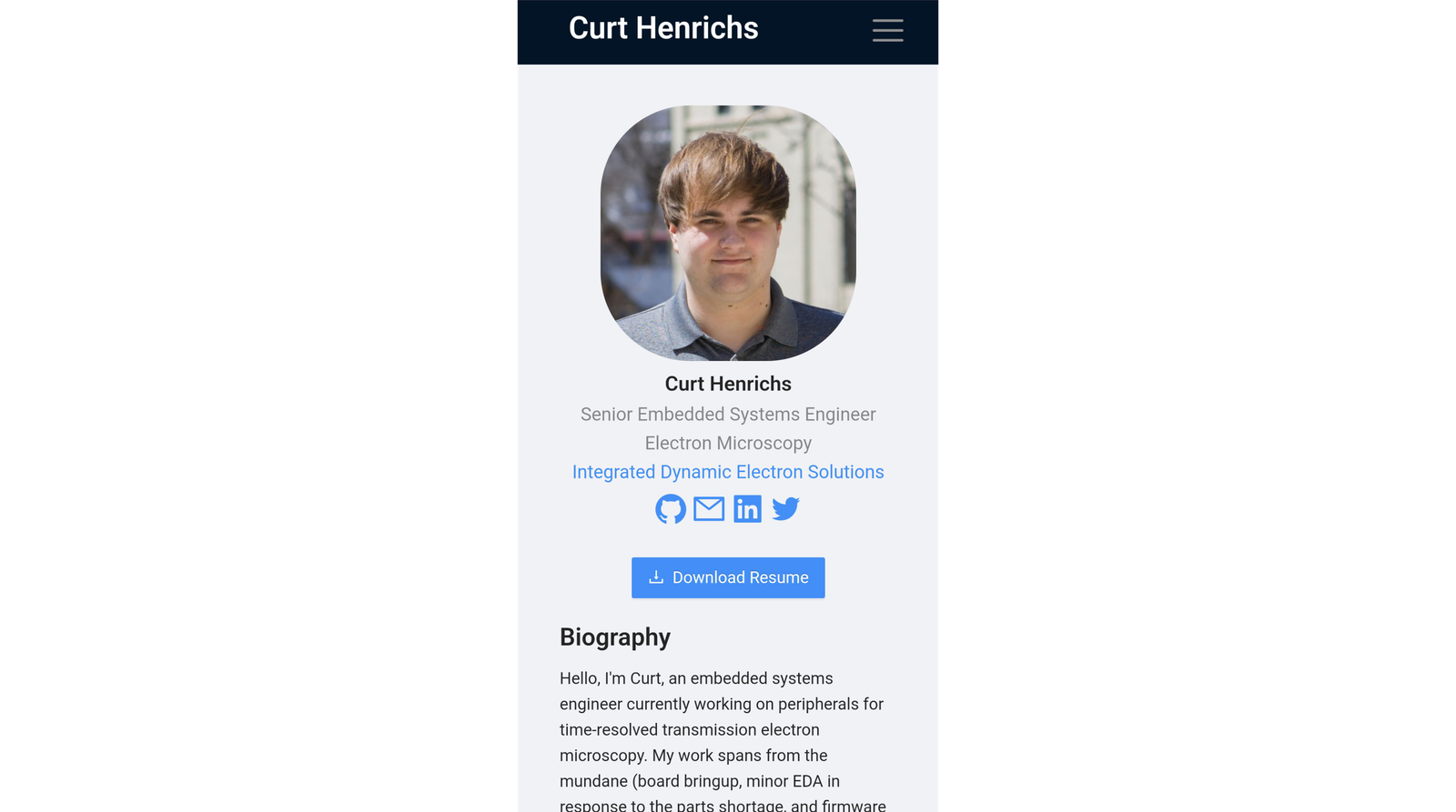
Mobile view ~ Home section
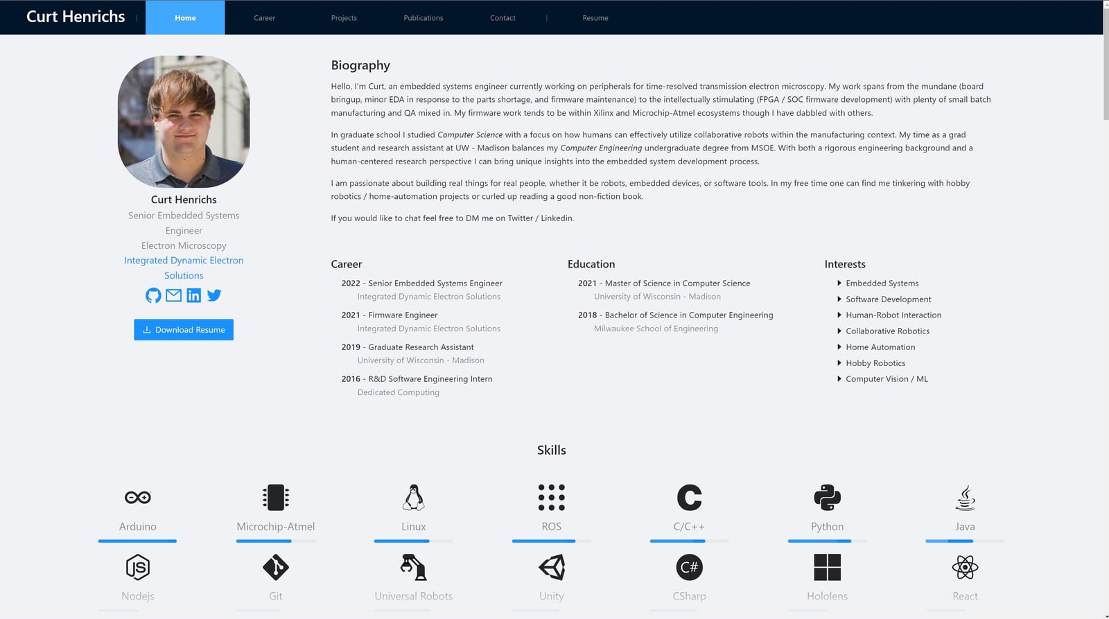
Desktop view ~ Home section and skills section
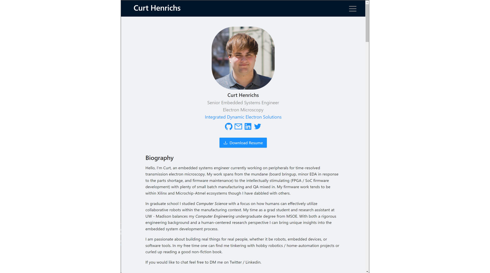
Tablet view ~ Home section
Mobile view ~ Home section
Desktop view ~ Home section and skills section


Portfolio Website
This website has been a project in its own right. Originally, I had planned on using a no-code / low-code tool to generate my portfolio website. However, I couldn't quite find a tool with the flexibility / configurability I had in mind for my website. More specifically, I wanted to aggregate my projects, skills, publications, social media profiles, etc. into one place that I had complete creative control over. To build this website, I tapped into my experience building robot user interfaces (a skill I picked up in graduate school).
Constraints
My primary constraint was that I wanted to build a static-hosted website on Github Pages. The upside was that this meant no backend service and database maintenance. Github pages also was a good target given cost and deployability. A secondary constraint was my target framework. During the time I started development of this website, I was also deeply involved in the development of CoFrame (see the project titled as such). CoFrame was built using React with Microsoft Fluent visual framework. My colleague and I wanted to move away from Fluent toward something he was more familiar with: Ant Design. So I set a constraint that this website would make use of Ant Design as a forcing function to learn it.
Development
My website went through three major cycles of development.
In the first cycle, I accomplished an MVP of my project vision. It was clunky. The project section was laid out as a two-dimensional grid with each project sized to fit its particular contents. As one can imagine it was chaotic. Additionally, there wasn't a clear separation of career from projects further muddling that section. I had also rushed past defining policies (e.g., terms of use) to get it published. It wasn't quite an asset yet but it did the job of aggregating information.
For the second cycle, my main goal was refinement and refactor. I updated all content on the website to be current. I removed/consolidated smaller projects that just served to clutter the projects section, and split career out into its own section. Lastly, I tweaked the responsive layout to better adjust for most screen configurations.
For the third cycle, I built most of the work with Claude Code, letting an AI agent do much of the implementation while I directed the design and reviewed what came back. The focus was polish rather than new features. I optimized the images (resized and re-encoded as WebP), which cut the image payload by roughly 80%, and reworked the loading so cards and images hold their space and shimmer while they download instead of popping in. I also started writing real tests, with a lot more planned for the next cycle.
The larger change was moving the site to a static-first, prerendered setup. Every page is now rendered to HTML ahead of time and hydrated in the browser. I did this partly with agents in mind: as more of the web gets read by AI agents rather than people, a prerendered page hands over its full content immediately, without waiting on JavaScript.
Accomplishments
I am rather pleased with the responsive look and feel, given my lack of expertise in the area. My goal was a summary section and skills section that adapt to screen width. I track width through a React context in the page template, so it updates live as you resize, and the summary swaps between three major layouts: phone, tablet vertical, and landscape. Smaller touches follow the same idea, like the header collapsing its navigation and the footer reshaping its sitemap on mobile.
I am also happy with how the content drives the site. Each project, career entry, and skill lives as structured data and markdown, and a small set of reusable components (cards, modals, and detail pages) render it. Adding or updating content is mostly a matter of editing data rather than chasing layout, and everything stays consistent because it all flows through the same templates.
For the skills section, I wanted multiple rows aligned to page center. Ant Design's grid does not handle that once the tiles overflow a single line, so I wrote an algorithm that splits the tiles into rows based on screen width, each row in its own centered grid. If there are more than two rows, a button expands or collapses the list instead of making you scroll through all of it.
What I am most excited about going forward is using this site to tie my work together. I have a growing set of projects and ideas that share a common identity, and this feels like the right hub to carry that branding across all of them.